Uniformity Figma Plugin
Building a perceptually uniform color system generator, from idea to design, code, polish, launch, and marketing. Live in the figma community now.
(Client)
Uniformity
(Year)
2026
(Skills)
AI
Plugin
Uniformity Figma Plugin
Building a perceptually uniform color system generator, from idea to design, code, polish, launch, and marketing. Live in the figma community now.
(Client)
Uniformity
(Year)
2026
(Skills)
AI
Plugin
Uniformity Figma Plugin
Building a perceptually uniform color system generator, from idea to design, code, polish, launch, and marketing. Live in the figma community now.
(Client)
Uniformity
(Year)
2026
(Skills)
AI
Plugin

(Context)
(Overview)
Developing an advanced color system generator for figma
Building color palettes is hard. Colors often are not structurally or perceptually uniform leading to more work and less color options for product design teams in their day to day design work. Most color tools let you pick colors, or adjust a color ramp.
(Role)
Product builder
Sole designer and builder — concept, color science, UX, design system, and the full production stack (auth, payments, sync), shipped to the Figma Community.
(Solution)
Uniform color space and a parametric curve
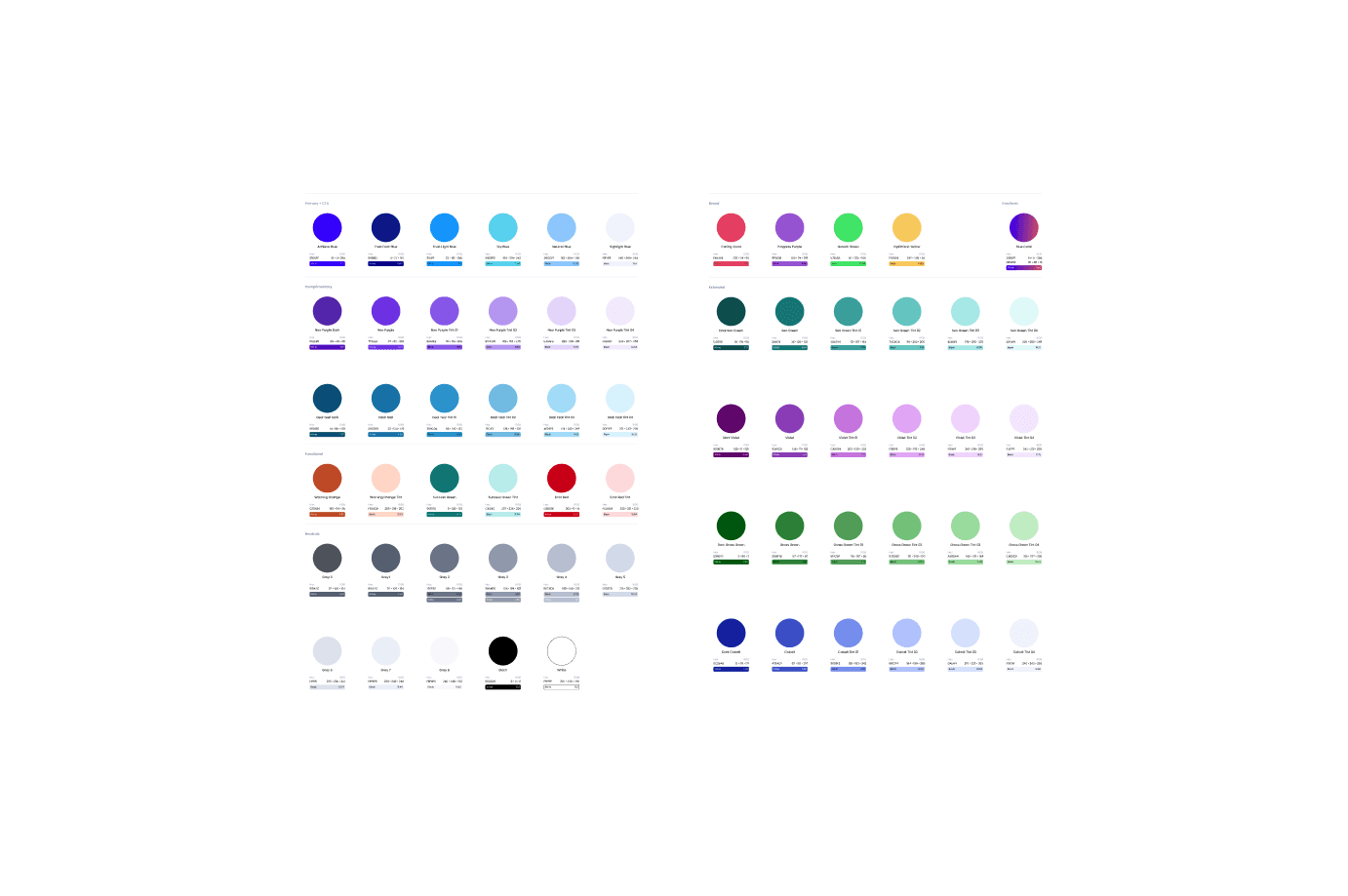
Uniformity lets you design a system, in seconds. Every ramp and color, calibrated to the same OKLCH powered bezier curve. Primary, neutrals, accents, and semantic feedback colors are all generated together, all perceptually consistent. This enables rapid generation, exploration, refinement, WCAG compliance, and new color ramps in seconds. Dont just build a palette, build a perceptually and structurally uniform color system that is ready for frameworks like Tailwind, ShadCN, Chakra, and brand clients alike.
(Context)
(Overview)
Developing an advanced color system generator for figma
Building color palettes is hard. Colors often are not structurally or perceptually uniform leading to more work and less color options for product design teams in their day to day design work. Most color tools let you pick colors, or adjust a color ramp.
(Role)
Product builder
Sole designer and builder — concept, color science, UX, design system, and the full production stack (auth, payments, sync), shipped to the Figma Community.
(Solution)
Uniform color space and a parametric curve
Uniformity lets you design a system, in seconds. Every ramp and color, calibrated to the same OKLCH powered bezier curve. Primary, neutrals, accents, and semantic feedback colors are all generated together, all perceptually consistent. This enables rapid generation, exploration, refinement, WCAG compliance, and new color ramps in seconds. Dont just build a palette, build a perceptually and structurally uniform color system that is ready for frameworks like Tailwind, ShadCN, Chakra, and brand clients alike.
(Results)
(Est. days saved)
2
Manually building vs Uniformity
(Test pipeline)
260+
Passing
(Full control)
1
Curve to adjust it all
(Results)
(Est. days saved)
2
Manually building vs Uniformity
(Test pipeline)
260+
Passing
(Full control)
1
Curve to adjust it all
(Results)
2
Manually building vs Uniformity
260+
Passing
1
Curve to adjust it all
(Context)
(The problem)
Color scales look uneven (lack of perceptual uniformity)
A color scale is fairly easy to get right. Many tools let you instantly generate a single great color scale. Getting scales right across a whole system is much harder. Each palette has to feel consistent with the ones next to it. The steps between values need to match in size, so 400 to 500 lands with the same weight as 600 to 700. Contrast has to hold up at every key stop. And the moment you change one color to fix a small issue, the rest of the system shifts with it, and you find yourself half way back to the start.

(Context)
(The insight)
The big bet: four new axioms
A tool that designs all of a system's color at once, from a single control, did not exist. Not because it is hard to code, but because four things have to be true at the same time before the idea is even worth trying, and most people do not hold all four at once. These combine into a single big bet and time will tell if it was correct.
(Axiom)
1. Color uniformity is desired
Begin with the question almost no one asks: why should every ramp share the same perceptual and structural shape? Most of the time it never comes up. You build each ramp until it looks right, and you move on. Having built a good many design systems, I knew the cost of going without. When ramps do not share structure, nothing composes. The 500 of one hue does not carry the weight of the 500 of another, so contrast breaks from one component to the next. Dark mode becomes a rebuild instead of a transform. Theming turns into handwork. Uniformity is not fussiness; it is the property that lets a system behave like one. Most tools do not deliver it because they were never aiming at it.
(Axiom)
2. Color can be precise enough to systematize
Suppose you do want uniformity. The usual objection is that color is too soft to control at the level of a whole system. It gets called subjective, and a single global control sounds like a fantasy. That belief is why every existing tool tunes one ramp at a time, and why none scale to a single model. The way through is OKLCH, a perceptual color space in which equal numeric steps actually look equal. Built on Björn Ottosson's OKLab and the okhsl and okhsv work that the OkColor community has carried forward, color becomes precise enough to reason about and to systematize. The imprecision was never in color itself. It was in the RGB and hex model we had been using to measure it.
(Axiom)
3. Knowing what "good" looks like
A perceptual space, on its own, does not hand you a good palette. You still have to encode taste, the sense of what makes a ramp read as right, and that you cannot get from math. A good ramp follows a pattern along its length. Lightness and chroma move together. The steps keep a rhythm. The hue is allowed to drift a little from light to dark, the way the best hand-mixed palettes do. Naming that shape precisely enough to encode it is its own kind of prerequisite, and it comes from having mixed a great many ramps by hand.
(Axiom)
4. The synthesis: one curve, every color
Put the first three together, and something simple falls out. Give yourself a perceptually uniform space, with lightness, chroma, and hue on axes that behave, and a model of what a good ramp's shape is. A whole palette can then be drawn as a single 2D curve across a hue-gradient canvas: lightness on one axis, chroma on the other, hue as the field behind them. One curve, pulled by hand, yields a structurally uniform ramp. And because the space underneath is uniform, the same curve laid across every hue yields a whole system that holds together. That was the move no one had made: not designing each ramp, but designing the curve that designs them all. Everything after it was execution.
(Axiom)
1. Color uniformity is desired
Begin with the question almost no one asks: why should every ramp share the same perceptual and structural shape? Most of the time it never comes up. You build each ramp until it looks right, and you move on. Having built a good many design systems, I knew the cost of going without. When ramps do not share structure, nothing composes. The 500 of one hue does not carry the weight of the 500 of another, so contrast breaks from one component to the next. Dark mode becomes a rebuild instead of a transform. Theming turns into handwork. Uniformity is not fussiness; it is the property that lets a system behave like one. Most tools do not deliver it because they were never aiming at it.
(Axiom)
2. Color can be precise enough to systematize
Suppose you do want uniformity. The usual objection is that color is too soft to control at the level of a whole system. It gets called subjective, and a single global control sounds like a fantasy. That belief is why every existing tool tunes one ramp at a time, and why none scale to a single model. The way through is OKLCH, a perceptual color space in which equal numeric steps actually look equal. Built on Björn Ottosson's OKLab and the okhsl and okhsv work that the OkColor community has carried forward, color becomes precise enough to reason about and to systematize. The imprecision was never in color itself. It was in the RGB and hex model we had been using to measure it.
(Axiom)
3. Knowing what "good" looks like
A perceptual space, on its own, does not hand you a good palette. You still have to encode taste, the sense of what makes a ramp read as right, and that you cannot get from math. A good ramp follows a pattern along its length. Lightness and chroma move together. The steps keep a rhythm. The hue is allowed to drift a little from light to dark, the way the best hand-mixed palettes do. Naming that shape precisely enough to encode it is its own kind of prerequisite, and it comes from having mixed a great many ramps by hand.
(Axiom)
4. The synthesis: one curve, every color
Put the first three together, and something simple falls out. Give yourself a perceptually uniform space, with lightness, chroma, and hue on axes that behave, and a model of what a good ramp's shape is. A whole palette can then be drawn as a single 2D curve across a hue-gradient canvas: lightness on one axis, chroma on the other, hue as the field behind them. One curve, pulled by hand, yields a structurally uniform ramp. And because the space underneath is uniform, the same curve laid across every hue yields a whole system that holds together. That was the move no one had made: not designing each ramp, but designing the curve that designs them all. Everything after it was execution.

(Development)
Making it real, in code
The idea was settled. Making it real was the work, and the work happened in code, with AI as the instrument that let me explore and build and refine faster than I could have alone. I was testing whether the synthesis actually held, finding the places where perception and math part ways, and tuning until it felt right. What follows is that build.
Parametric curve
The whole product comes down to one gesture: a 2D curve through perceptual space that decides how lightness and chroma travel from the lightest tint to the darkest shade. You cannot sketch this in Figma. A picture of a curve tells you nothing about how it feels to drag, how the steps redistribute when you pull a control point, where it catches and snaps. The behavior is the design, and the behavior does not exist until it runs. So I built it as a live instrument and tuned it by feel. It began as a quadratic Bézier. It became an interpolating circumcircle spline, so the tangent at the midpoint stayed natural. Then it grew a step-spacing system, with split easing, clamp zones, and magnetic snap, so the named steps from 50 to 950 land evenly to the eye rather than evenly in arithmetic. Most of those calls I could make only by grabbing the handle and watching whether 400 to 500 still lurched. With AI as my implementation partner, the loop from a sentence ("the dark end should hold its chroma longer") to the result on the canvas ran about a minute. I was not writing production color science the way an engineer would. I was using code as a design medium. The same method produced Uniformity Auto, a mode that nudges a ramp to stay perceptually even and asks the user to touch only a single strength slider. That feature can be designed only in code, because its whole value is the behavior: the correction you cannot see, happening as you move.
The math had to be built, not imported
Perceptual uniformity is a mathematical claim, and you cannot fake it with a CSS gradient. Every color the tool shows has to cross between sRGB and OKLCH, get measured against the limit of what a screen can display, and come back without lying about what is reachable. A heavy color library would have bloated the plugin and still missed the gamut behavior I needed. So I wrote the engine from scratch, inline, with no dependencies: the OKLab to linear-RGB transforms, the OKLCH round-trips, and a pair of alternate perceptual spaces, OKHSL and a squared-chroma variant, so the canvas could speak whichever model suited the moment. The forward math was not the hard part. The gamut boundary was. Many tools quietly clip when a color runs past what a screen can show, which is one way you end up with muddy, dead color. I handled it with a binary search that finds the most saturated in-gamut chroma at a given lightness and hue, so the tool shows the most vivid color that survives on screen and draws the boundary instead of hiding it. The blowout at the edge of the canvas, where saturation runs past the displayable, took a long run of attempts before it behaved. That was research, real research, but research I could do only where the problem was visible.

(Development)
(Design system)
A design system for the design tool
A tool about visual consistency cannot itself look inconsistent. Yet a plugin this dense, with a canvas, a curve editor, ramp columns, dropdowns, sliders, and modals, slides into visual entropy the moment you build it one screen at a time. So I built a design system alongside the product: semantic color tokens, a single menu system that replaced every native control, skeuomorphic control cells sharing one lighting model, and one spacing token that every gap in the interface runs through. The surfaces, the eyedropper modal and the curve menus and the account screens, are all assembled from the same vocabulary, so polishing one cell polishes the rest. The data got the same discipline. The default curve values live in one frozen source-of-truth file, edited by hand and checked against the running tool, never generated. For a tool that argues for consistency, that kind of precision felt like part of the argument.
Defining the MLP

(Refinement)
(Seed Import)
Reading intent out of color
A designer rarely starts from a blank curve. The starting point is usually colors already in hand: a Figma selection, a brand handed down from somewhere. So the tool has to look at an arbitrary set of swatches and work backward to the curves that would regenerate them. Which color is the light anchor, which is the dark, where the midpoint falls, what the hue is doing along the way. It is a genuine inverse problem, with no clean answer, and it is invisible. There is nothing to mock, only behavior to get right. So I built a seeding system. It clusters the chosen colors, routes each one to the right anchor by its true lightness, and extends the curve's endpoints through the seeds, fitting as many as four linked ramps from a single eyedrop and letting the designer pick the primary. Making it trustworthy meant tracking down the places where perception and math disagree. A near-white at the top of a scale carries real hue direction that a naive threshold discards as gray. A seed at zero strength has to mean off, not full, even though 0 reads as false in the language the sandbox runs. Those were bugs I could find only by watching a real color come back wrong by a hair, and then refusing to let the hair go. The reward is a tool that meets designers where they already are, with the colors they already have, instead of asking them to start over.
(Testing)
Proving the invisible
A color tool that is almost uniform is not much use. And almost is impossible to judge by eye across every hue, every strength, and every point on the canvas. The premise collapses the first time someone finds a combination that drifts. Correctness here cannot be a feeling. It has to be something you can check. So I built an automated pipeline suite into the tool itself, running every hue against every strength against every position on the canvas, with a stack of assertions on each case: no chroma spilling past the gamut boundary, compensation never exceeding the requested strength, round-trip color error inside a tight tolerance, the snap handle staying fixed to its dot, and a check at the level of the rendered page that reads the actual swatch and confirms it matches the math. When a regression slipped in, the suite named the exact hue-and-strength cell that broke. The point was never the size of the number. The point is that "perceptually uniform" could be proved by machine instead of asserted by hand.

(Shipping)
(Shipping)
Going to market
A prototype dies on a laptop. A product needs accounts, payments, a way to carry a designer's work from one machine to the next, and a road into a public marketplace, none of which a designer is usually expected to build. So I built the production stack myself. Passwordless magic-link authentication on Supabase, with a nonce relay so the plugin can finish signing in without ever holding a password. Subscriptions through Lemon Squeezy webhooks. Cloud sync, so a Pro user's saved palettes follow them between machines, layered onto the existing auth with no new services. Branded transactional email that survives Gmail's dark mode. And a freemium boundary enforced across the ramp limits, the palette modal, and the gated controls. Then I shipped it to the Figma Community. The prototype became a product not because I stopped designing, but because the same in-code method carried straight through to the parts of the build that usually fall to someone else.
(What Changed)
From eyeballing to a system you can prove
Before: you pick colors by eye, build a scale that looks fine on a white slide, hand it off, and watch it break in the product, with no language for why. Then you tweak it and resubmit, and tweak it again. After: you seed from any selection, and the system regenerates perceptually uniform ramps across every role at once, honest about the gamut boundary. You steer with intent rather than sliders. You export a scale that holds up in a real interface, because it was built on the way vision actually works, and then verified to behave. The shift that mattered is this. The very things a color tool likes to call too subjective to systematize, perceptual evenness, gamut limits, the reading of intent out of existing color, turned out to be designable. Not written into a document and approximated later, but designed in code, where the behavior could be felt, tuned, and checked.
(Shipping)
(Shipping)
Going to market
A prototype dies on a laptop. A product needs accounts, payments, a way to carry a designer's work from one machine to the next, and a road into a public marketplace, none of which a designer is usually expected to build. So I built the production stack myself. Passwordless magic-link authentication on Supabase, with a nonce relay so the plugin can finish signing in without ever holding a password. Subscriptions through Lemon Squeezy webhooks. Cloud sync, so a Pro user's saved palettes follow them between machines, layered onto the existing auth with no new services. Branded transactional email that survives Gmail's dark mode. And a freemium boundary enforced across the ramp limits, the palette modal, and the gated controls. Then I shipped it to the Figma Community. The prototype became a product not because I stopped designing, but because the same in-code method carried straight through to the parts of the build that usually fall to someone else.
(What Changed)
From eyeballing to a system you can prove
Before: you pick colors by eye, build a scale that looks fine on a white slide, hand it off, and watch it break in the product, with no language for why. Then you tweak it and resubmit, and tweak it again. After: you seed from any selection, and the system regenerates perceptually uniform ramps across every role at once, honest about the gamut boundary. You steer with intent rather than sliders. You export a scale that holds up in a real interface, because it was built on the way vision actually works, and then verified to behave. The shift that mattered is this. The very things a color tool likes to call too subjective to systematize, perceptual evenness, gamut limits, the reading of intent out of existing color, turned out to be designable. Not written into a document and approximated later, but designed in code, where the behavior could be felt, tuned, and checked.
(Results)
(Days saved)
2
By hand vs auto generation
(Test pipeline)
260+
Passing
(Full control)
1
Curve to adjust it all
(Results)
(Days saved)
2
By hand vs auto generation
(Test pipeline)
260+
Passing
(Full control)
1
Curve to adjust it all
(Results)
2
By hand vs auto generation
260+
Passing
1
Curve to adjust it all
(Takeaways)
What the project taught me
When the interaction is the design, design in the interaction. A perceptual curve, a gamut boundary, a correction that happens as you drag: none of these survive a static mock. The honest medium for them is the running thing. AI shortens the distance between taste and execution. The judgments stayed mine: where a step should land, how the dark end should hold its chroma. What changed is that acting on each one took a minute instead of an afternoon, so I could try more of them. "Too subjective to systematize" usually means it has not been designed in the right medium yet. Color perception felt unspecifiable until I could grab it, watch it, and test it. The subjectivity did not vanish. It became something I could steer. A claim like "perceptually uniform" is worth more when it is checkable. The binary-searched gamut boundary and the automated suite were not polish. They are what let the premise hold up under scrutiny. The in-code method does not stop at the interface. The same loop that tuned a curve also stood up the auth, the payments, the sync, and the release. On this project, at least, designing in code was less a prototyping trick than a way to carry one idea intact, from the first pull of a handle to something a person could install.