ATX Ad Fed
A cutting-edge digital platform designed to revolutionize the way people interact with technology.
(Client)
AAF
(Year)
2021
(Skills)
Web design
ATX Ad Fed
A cutting-edge digital platform designed to revolutionize the way people interact with technology.
(Client)
AAF
(Year)
2021
(Skills)
Web design
ATX Ad Fed
A cutting-edge digital platform designed to revolutionize the way people interact with technology.
(Client)
AAF
(Year)
2021
(Skills)
Web design
(Context)
Overview
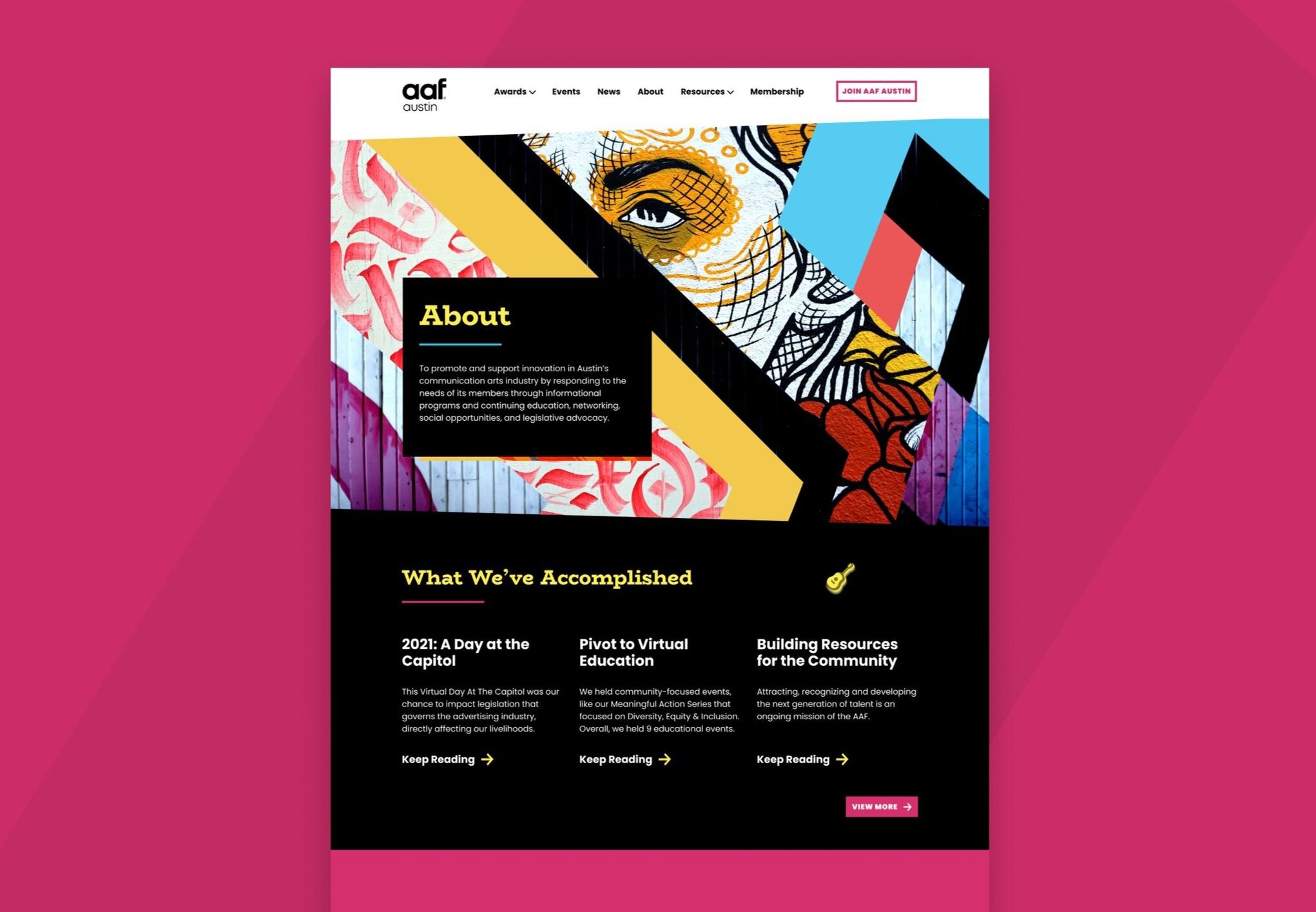
The Austin chapter of the American Ad Federation is an organization that supports and elevates the local communication arts industry through educational, networking, and legislative efforts. They asked a team of volunteers to help them rebuild their aging website in order to improve award ticket purchases, membership conversion, and most importantly a better sense of community and site engagement.
Role
My role was very similar to that of my colleagues: to shape the research and project plan and then build out wireframes and high fidelity deliverables for the development team.
Solution
A refreshed website with much more clear information architecture, CTAs, and membership purchasing page, as well as a dynamic contact form designed to improve member engagement while simplifying the backend update process.
(Context)
Overview
The Austin chapter of the American Ad Federation is an organization that supports and elevates the local communication arts industry through educational, networking, and legislative efforts. They asked a team of volunteers to help them rebuild their aging website in order to improve award ticket purchases, membership conversion, and most importantly a better sense of community and site engagement.
Role
My role was very similar to that of my colleagues: to shape the research and project plan and then build out wireframes and high fidelity deliverables for the development team.
Solution
A refreshed website with much more clear information architecture, CTAs, and membership purchasing page, as well as a dynamic contact form designed to improve member engagement while simplifying the backend update process.

(Results)
Fewer clicks to critical tasks
Developing the project was a challenging task, and I encountered several design obstacles along the way. I had to create an intuitive user interface that would work seamlessly with advanced features while maintaining a balance between aesthetics and functionality. Additionally, I had to ensure that the platform was scalable, secure, and user-friendly.
Understand
Understand
Understand
(Process)
Brief
AAF President's Brief
Empathise
1o1 interviews, competitive analysis, journey maps
Define
New goals
Prototype
Branding, design system, low fi mockups, prototype, testing x2
(Process)
Brief
AAF President's Brief
Empathise
1o1 interviews, competitive analysis, journey maps
Define
New goals
Prototype
Branding, design system, low fi mockups, prototype, testing x2
(Process)
Brief
AAF President's Brief
Empathise
1o1 interviews, competitive analysis, journey maps
Define
New goals
Prototype
Branding, design system, low fi mockups, prototype, testing x2

(The problem)
Unclear CTAs, hard to update
The website was designed for dynamic events to be displayed but was very hard to update for the AAF staff. There is a lack of clear CTAs.
(The problem)
Unclear CTAs, hard to update
The website was designed for dynamic events to be displayed but was very hard to update for the AAF staff. There is a lack of clear CTAs.
(The problem)
Unclear CTAs, hard to update
The website was designed for dynamic events to be displayed but was very hard to update for the AAF staff. There is a lack of clear CTAs.
(Understand)
We interviewed key stakeholders
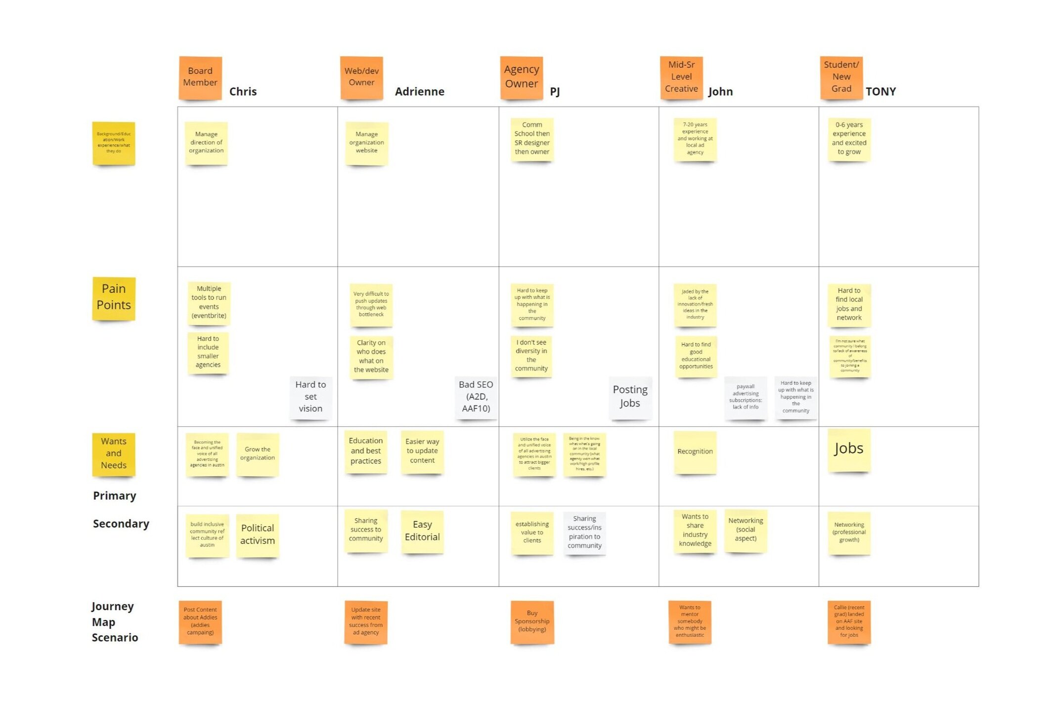
We interviewed ten stakeholders ranging from boar members to potential members using 1o1 scripted 30 minute discussions. After synthesizing this information. We could see that there were many user types and built journey maps with micro persona for each.
(Understand)
We interviewed key stakeholders
We interviewed ten stakeholders ranging from boar members to potential members using 1o1 scripted 30 minute discussions. After synthesizing this information. We could see that there were many user types and built journey maps with micro persona for each.
(Understand)
We interviewed key stakeholders
We interviewed ten stakeholders ranging from boar members to potential members using 1o1 scripted 30 minute discussions. After synthesizing this information. We could see that there were many user types and built journey maps with micro persona for each.

(Understand)
Journey maps for each kind of user
We had many stakeholders not only including the younger prospective end users, but also agency owners, mid level creatives, the comms team tasked with maintaining the site and finally the organizations leadership team.
(Understand)
Journey maps for each kind of user
We had many stakeholders not only including the younger prospective end users, but also agency owners, mid level creatives, the comms team tasked with maintaining the site and finally the organizations leadership team.
(Understand)
Journey maps for each kind of user
We had many stakeholders not only including the younger prospective end users, but also agency owners, mid level creatives, the comms team tasked with maintaining the site and finally the organizations leadership team.
Define
Define
Define

(Key findings)
Many users, clear values, CTAs, Better CMS
We understood we needed to offer a site that worked for at least five different user groups including backend comms/IT, board members directing future site growth, experts and agency owners looking for what is happening with other local ad groups, mid level creatives looking to network and mentor, and young creatives looking for job opportunities. We also wanted to provide cleaner routes to becoming a member and lastly we wanted to ensure that the backend is much easier to update and manage.

(Ideate)
Rebuilding the site map
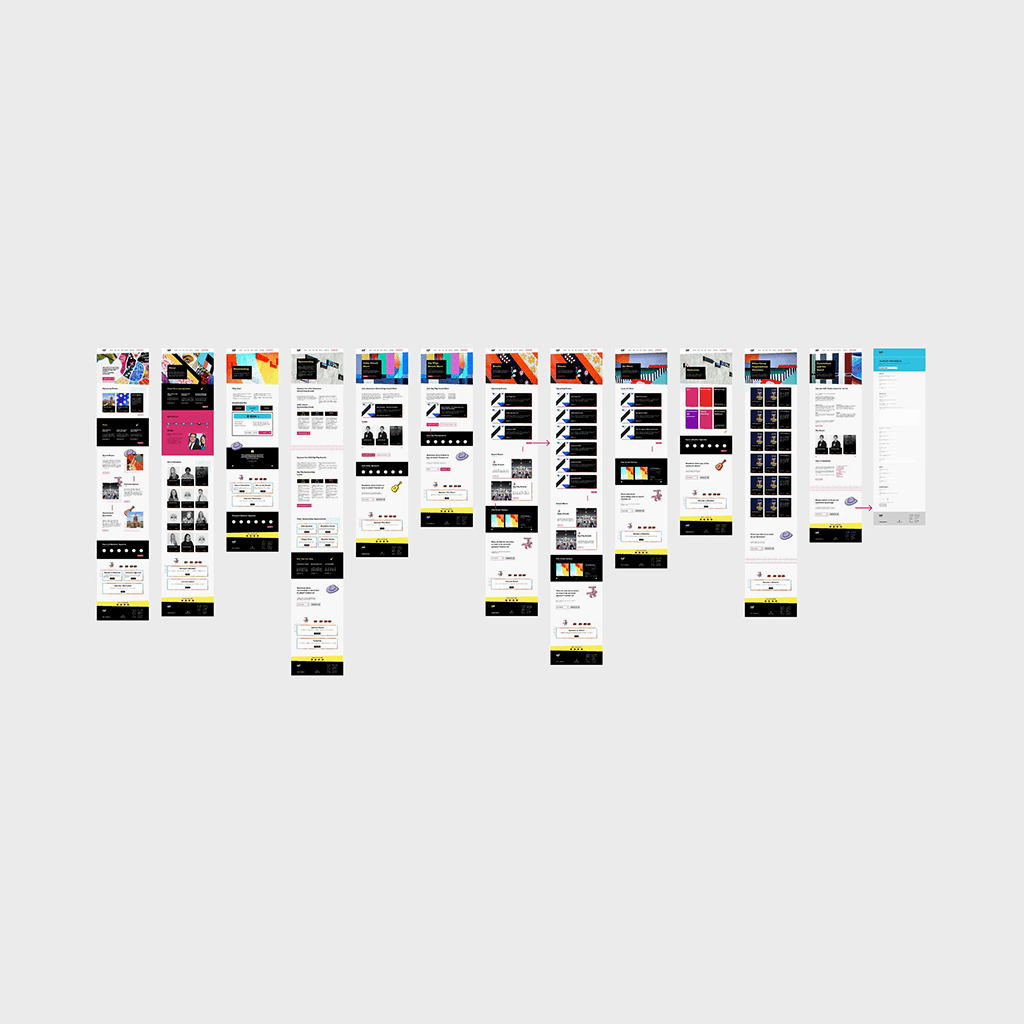
The old site was difficult to update, leading subsequent site owners to tack on new pages in a haphazard way. News was separated into several locations, and many links are broken. The new site map provides a much more efficient information architecture for each of the five user types we defined earlier.
(Ideate)
Rebuilding the site map
The old site was difficult to update, leading subsequent site owners to tack on new pages in a haphazard way. News was separated into several locations, and many links are broken. The new site map provides a much more efficient information architecture for each of the five user types we defined earlier.

(Ideate)
Initial wireframe
We built out our first wireframe in order to better understand the components which could be useful and to see if the information presented was effective. We could see that several components might be reused making development more easy:- Simplified membership pricing component- Highly reusable card system- Information ladder cards

(Ideate)
Keeping Austin weird
We also heard from users that they really enjoyed the old site’s bold and funky color pallet. We decided to incorporate the concepts of bold design and colors as well as the myriad of murals found locally in central Austin into our design language.
(Ideate)
Keeping Austin weird
We also heard from users that they really enjoyed the old site’s bold and funky color pallet. We decided to incorporate the concepts of bold design and colors as well as the myriad of murals found locally in central Austin into our design language.
(Ideate)
Keeping Austin weird
We also heard from users that they really enjoyed the old site’s bold and funky color pallet. We decided to incorporate the concepts of bold design and colors as well as the myriad of murals found locally in central Austin into our design language.
Deliver
Deliver
Deliver

(Research round 1)
Research: Dynamic forms
In our interviews we discovered that maintaining the site from the backend was a herculean task and that the challenge of doing so had led to a very high turnover rate amongst the backend AAF team. Additionally we found many broken links and various questionnaire systems in place. We wanted to simplify all of this with a unified form field that uses JavaScript to take the user to the correct version of the form field. Because this form confirms that users have input the correct information before submitting the backend comms team will have a much easier time reviewing and uploading the information.
(Research round 2)
Improvements to card UI
cleaning up card UI and providing guidelines around proper card usage for events. Limiting the amount of event details provided in the image section of each card. Details around date, time and location and more should be provided in the copy section of each card.
Improved scanability
users would like the ability to view all board members at once (rather than navigating through a carousel) on the About Us page. In addition, a quick blurb for each board member providing context around why they hold their respective position in the organization (ie: occupation or relevant prior experience) was also suggested to build rapport and organization credibility.
Better value prop
Improve layout of “Why Join” section of the page and provide additional detail regarding benefits and links to relevant pages such as programming, job postings, events, etc.
Clarity around Award Shows
Headline and copy improvements pertaining to Awards throughout the website so that users that are not familiar with AAF’s involvement in award shows have additional context.